Getting Riders Where They Need to Be, On Time: A busby Case Study
Project Overview
Client
A fictional transportation agency based in the midwest.
Problem
Due to a recent expansion of bus routes in a midwestern city, a transportation agency wants to develop a better way of communicating a bus’s expected arrival to riders.
Solution
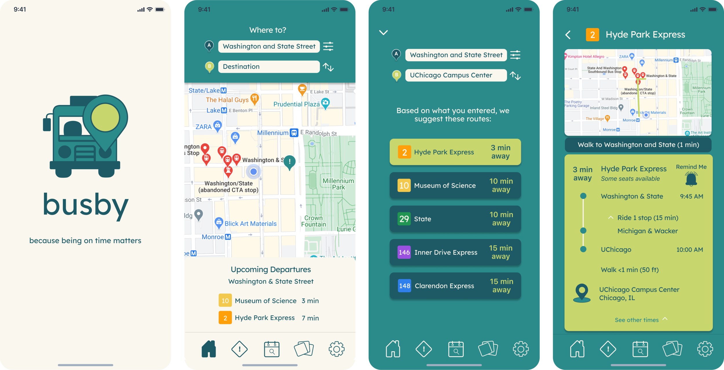
busby, a mobile application that lets users view up-to-date information about an upcoming bus, route schedules, and even set reminders about an upcoming bus.
Role
As this was a solo project, I was responsible for the user research, persona development, wireframing, visual design, and prototyping that went into creating busby.
Discovery and Research
Competitive Analysis
Before designing busby, I looked at two transit tracker apps, Citymapper and Google Maps, to see what they were offering to users and what could be improved. While both apps did an excellent job of communicating information regarding an upcoming bus, Citymapper’s interface was sometimes busy and overwhelming, particularly in cities with multiple public transit options.
User Surveys
To learn more about the people I’d be designing for and their experiences with riding public transportation, I conducted user surveys with riders, many of whom were between the ages of 19-36 and live in a metropolitan area.
The insights gained from the survey were not all that surprising. People who use public transit have places to be, so when a bus unexpectedly runs behind schedule or doesn’t show up, they have to quickly figure out an alternative way of getting where they need to be.
User Interviews
Wanting to know more about pain points for riders, I followed up with some of the participants from the survey. I learned that not only do riders want to know real-time updates about a bus’s current location and expected arrival time, they also want to know other information that can affect the outcome of their trip, such as available seating, how clean a bus is, and the time it will take to transfer buses.
Persona Development
With these insights in mind, I created two user personas that helped to guide my decision making throughout the process of designing the busby app, Draya and Mohammed.
Information Architecture
App Map
To design a product that not only met the requirements of the client but also the expectations of riders who would ultimately use it, it was important to organize information that would be shown on the app in a way that was easy to follow.
User Flows
Creating user flows allowed for me to better visualize how I wanted riders to interact with the final prototype. It was important that they could find the information they need within a few taps.
Sketches
Keeping in mind all that I learned from conducting competitive analyses and user surveys/interviews, I began sketching. My goal for sketching (and wireframing) was to create an experience for riders that already felt familiar. I included many of the elements already seen in apps like Google Maps and Citymapper.
Wireframing
Brand Development
In their interviews, riders mentioned the importance of being able to know all the details about their trip, such as expected time arrival, seat availability, and cleanliness. Riders have places to be, and they shouldn't have to spend a lot of time looking for this information. These factors ultimately impact the kind of riding experience they have, so it was essential to present this information clearly at every possible opportunity.
On Accessibility
Though it was not explicitly required from the client, I kept accessibility in mind as I designed a hi-fi prototype for busby. I worked with a color palette that not only reflected accuracy and reliability but was colorblind-friendly. I utilized high-contrast color combinations where I could to increase readability. I used Lexend Deca, a font originally designed to improve reading proficiency, as my primary font so riders won't have to spend a lot of time finding out when to expect their bus to arrive.
Usability Testing
After several rounds of iterating on my wireframes, I was able to create a prototype that I tested for usability with four participants.
Based on my findings, an onboarding would be a great addition to the prototype. That way, users will have a better understanding of how to navigate through the app and won't hesitate as much.
High-Fidelity Prototype
Takeaways
Though it felt tedious, constantly requesting feedback on and iterating upon my sketches and wireframes allowed for me to have an easier prototyping experience. Because I was able to point out and fix major pain points early on, I saved myself time and unnecessary frustration.

